“For each programme, we also analyse data from previous years in Hippocampus, allowing us to map out different scenarios for our recruitment.”

Jan Withofs

Jan Withofs

Head of Marketing

Marketing Communications Advisor, Graafschap College

UCLL University of Applied Sciences logo

HOW IT WORKS

HOW IT WORKS

Insight into your recruitment,
for everyone who needs it

Templates

Every profile, interest, and touchpoint comes together in Hippocampus’s interactive dashboard. At a glance, you can see exactly where your recruitment stands: by institution, faculty, course, or campus. For most universities, this offers more than enough insight, and for those who want to go deeper, data exports easily to your own BI environment. • Real-time dashboard showing the status of all recruitment activities • Breakdown by course, location, faculty, or campaign • Share instantly with colleagues and leadership • Easy export to your own BI environment, such as Power BI or Tableau

From IT dependency to independent analyses
From central reporting to insights at all levels
An isometric illustration of a dashboard with enrolment graphs, powered by calendar, email, and contact data
An isometric illustration showing an organised calendar and gear icon, effortlessly sending scheduled emails at set times
Isometric illustration of growing groups of prospects with verified emails above them
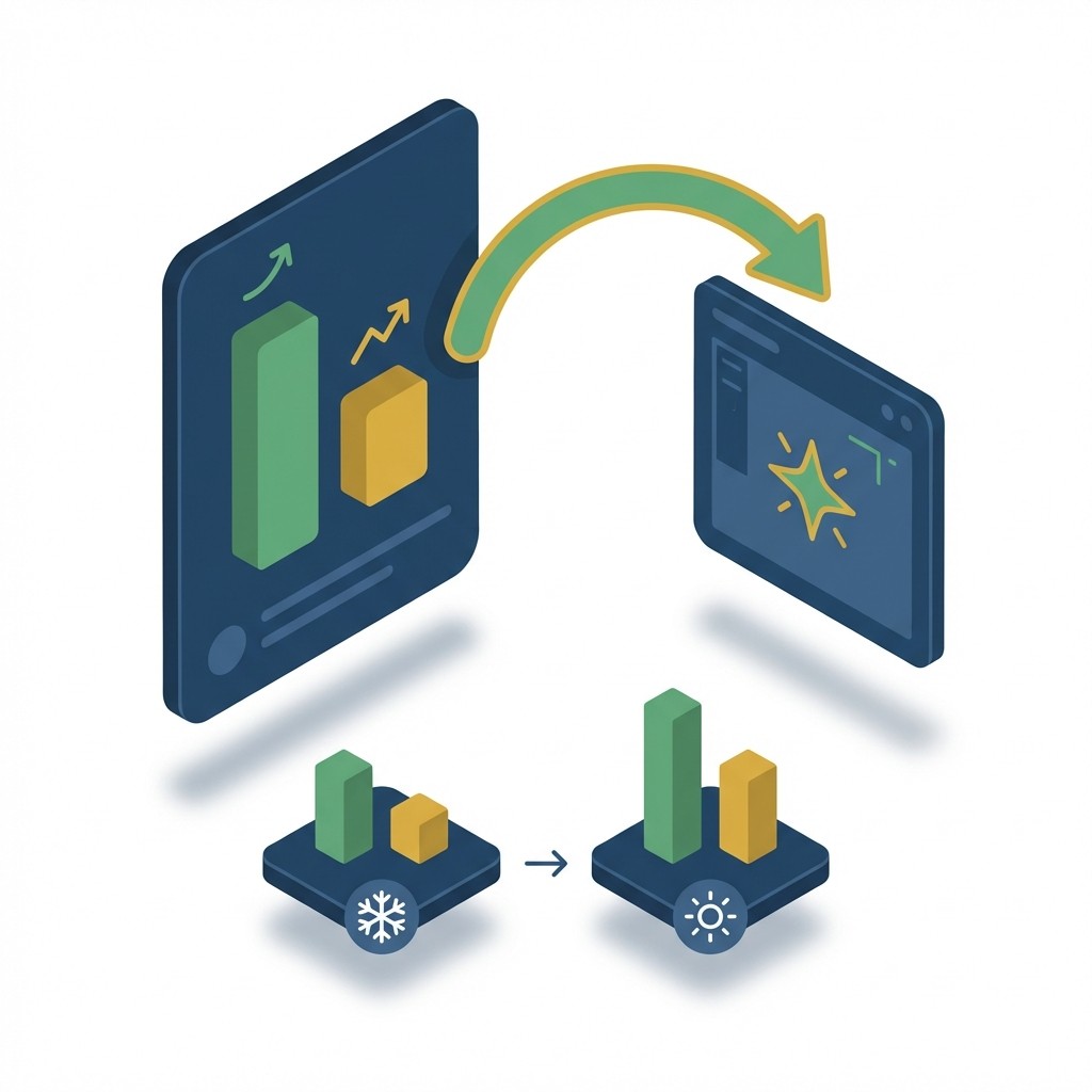
Isometric illustration of cold data being transformed into a rich, real-time dashboard
Templates

All profiles, interests and contact moments come together in Hippocampus’s interactive dashboard. At a glance, you can see how recruitment is progressing — by institution, faculty, programme or location. For most institutions, this is more than enough — and for those who want to go deeper, data can be exported to their own BI environment. Real-time dashboard showing the status of all recruitment activity Breakdown by programme, location, faculty or campaign Easy to share with colleagues and leadership Export to your own BI environment, such as Power BI or Tableau

From IT dependency to independent analyses
From central reporting to insights at all levels
An isometric illustration of a dashboard with enrolment graphs, powered by calendar, email, and contact data
An isometric illustration showing an organised calendar and gear icon, effortlessly sending scheduled emails at set times
Isometric illustration of growing groups of prospects with verified emails above them
Isometric illustration of cold data being transformed into a rich, real-time dashboard

Trusted by 50+ higher education institutions